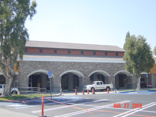
New Street Signs: Assessing the Hump

STUPID NEW STREET SIGNS

The first thing that came to my mind when I first saw these street signs was: am I the only one that thinks these things look like something I might find at Knotts Berry Farm or the dopey French Quarter at Disneyland?

There is something odd about the idea that a street sign needs to be treated as an “aesthetic” object – meaning that it is subject to the whims of visual preference among some class of people self-appointed to pass judgement on such things. A street sign is a street sign. The first necessity is functionality. Can it be read easily, and read at night? Is is affordable? After all, the taxpayer is footing the bill, rarely the individual who makes the “design” choice.

But there is something more subtle and just as pernicious as mistaking a utilitarian object for an artistic one. And that is the application of boneheaded and embarrassing aesthetic choices. We have already illustrated the confused thinking behind the aesthetic viewpoint that prefers the curved to the straight line, the complicated over the simple. Remember this post on Fullerton’s goofy redevelopment sidewalks?

And in our numerous posts that have railed against fake old we have also criticized the bureaucratic bad taste that adores the hideous old-timey themes so prevalent in insecure places like Fullerton. Who knows why there is a hump on the top of these signs? Is it something someone saw somewhere? Something picked at random out of a street sign catalogue by a traffic engineer? Are we supposed to discern an echo of the Mission Revival espadana in the hump – like those disgusting Taco Bell outlets of the 80s? Who cares?

This is just another example of confusion: confusion that a street sign needs to be gussied up; confusion that a hump on top is better than a simple rectangle; and confusion that the inclusion of the almost illegibly dinky word “Fullerton” somehow adds something to the ensemble.

Say, whatever happened to that Country Bear Jamboree?

Give It Back. Now.

We received an e-mail the other day from a Friend calling herself “Lady Artist.” It was a good letter and it made some excellent points so we agreed to publish it.

3958634055_8f99140517
Didn't they put a moustache on the Mona Lisa?

The City of Fullerton has proven to be a faithless custodian of a modern architectural gem. I have come to the conclusion that the best fate of the building that has come to be known as the Hunt Branch Library is to give it back to the Norton Simon Foundation or, at least to someone who will appreciate it.

William Pereira designed this building in concert with a larger, integrated development; a site plan that included the Hunt Administration Building and coordinated landscape that included a reflecting pool and “floating”  concrete slabs and steps. Over the years the property has been partitioned by a fence, the reflecting pool filled in by its new owners, with new and comically bad architecture burdening the site. Perhaps most insulting of all, the City has put a “bark park” on the grounds next to the library.

A bark park. Great for dogs, insulting for a work of art. Unless by art you mean a group of dogs playing poker.

In the eyes of the beholder...
Fullertonians may not know art, but they know what they like.

I believe that almost anybody would be  a more reliable guardian of this building than the City has shown itself to be. The homeless people who camp out under the extended roof seem to appreciate it more than the City does.

I also believe the present location for a branch library couldn’t be worse. It is not well known, and frankly, I question the number of users claimed by the Library itself in its annual counts. Why continue to fund a branch library at this near-hidden location when neither north nor east Fullerton have branch libraries at all; not to mention that the existence of the Hunt Branch would probably come as a complete surprise to most west Fullerton denizens? But these are separate issues in themselves, and I digress.

For years I’ve heard all this weeping and wailing about how Fullerton could have had the Norton Simon Museum. Why mourn that? Fullerton doesn’t deserve it. Never did. The inescapable evidence is on display at the Hunt Branch every day of the year. 

Let’s give it back to Norton Simon, with our thanks; and our apologies for not recognizing the architectural legacy that he gave us.

Thank you, Lady Artist, for a thought-provoking piece.

Abolish Fullerton’s RDRC!

Some folks say brick veneer is a perfect symbol of the RDRC...

In the post about brick veneer stuck on to the side of the proposed parking structure on Santa Fe (here), admin added a helpful comment that shared the minutes of the Redevelopment Design Review Committee (RDRC) meeting when the parking structure was considered by the committee. Although the members of the committee quibbled with this or that detail of the structure, none of them opposed or even questioned the project architects idiotic statement that the fake brick was there to “relate to” buildings on Harbor. One of the members even proposed the thin-set type of brick to save money

While we have to wonder if the architect had been coached beforehand by staff to pay homage to Fullerton’s obsession with brick veneer, the main point of this post is to ask why nobody on this hapless committee even bothered to question the comical notion that a concrete parking structure needed a fake veneer in order to relate to other fake brick veneer buildings in downtown Fullerton.

And so we repeat our challenge to Fullerton: ABOLISH THE RDRC!

Update: We have received word from an RDRC member that the committe was told that brick veneer was necessary as a CEQA mitigation for a Negative Declaration; that, in effect, the brick veneer would make the building compatible with other brick buildings in downtown Fullerton.

Just as we suspected. This “mitigation” is simply staff’s way of getting what they want: brick veneer. There is absolutely no need to “mitigate” a non-existent problem. If we can believe the RDRC member this was simply a matter of personal aesthetic taste – and poor taste at that. 

The Curse of Brick Veneer

One of the biggest selling points of Redevelopment is that it’s supposed to make things look better. Especially buildings. As its legal justification, Redevelopment is supposed to eradicate blight. In Fullerton most of what Redevelopment coughs up seems to look more and more like blight every time we look at it.

Our pages have been strewn with examples of cheap, crappy, banal, and cheesy buildings underwritten by Redevelopment, whose design has been guided by the shaky hand of Redevelopment bureaucrats who have micro-managed downtown Fullerton into an open air museum of aesthetic horrors.

But today, let’s focus on one our biggest pet peeves: Redevelopment’s penchant for brick veneer – one of an angry God’s most certain punishments visited upon humankind.

brick-veneer-1
The Trider Building. Unintended hilarity ensued.

The “Trider Building” on the SW corner of Pomona and Commonwealth showcases the cheapest of all the brick veneers – what the professional masons call “lick and stick.” This crap was applied to a black mastic background and began to pop off almost immediately. Recently somebody was employed to fill in the joints with mortar, presumably to arrest the pop-off effect, but they only got a few feet off the ground before they stopped. The result looks even worse than ever except that at least now there is an undeniable comic effect not calculated in the original design.

brick veneer 2
Quick, put a plaque on it before it gets away...

Here’s an example where a grouted veneer runs headlong into what appears to be another lick-and-stick. Neither one looks good. Juxtaposed the effect of cheapness is intensified.

For years the Redevelopment and Development Services Departments not only tolerated, but  actually foisted brick veneer on the rest of us – presumably because old buildings are made of brick and brick veneer is made of brick, and Fullerton is all about preserving old things. The whole idea of regurgitating old building themes in fake materials was, and still is, the order of the day. And so the idea of original and creative design has been intentionally jettisoned for the architectural garbage that litters downtown Fullerton.

Coming up soon: The Horrors of Styrofoam.

The RDRC and Jay Eastman Take A Curtain Call

DSC00132

Don’t say we didn’t warn you. Because we did. In previous posts  here and here, we tracked the progress (if you really want to use that word) of the strip center at Euclid and Rosecrans. Well, the scaffolding has come down and what’s revealed ain’t purty.

Our theme here was wasted space and building materials and of course, The City’s dubious commitment to the idea of sustainability. And our purpose was not to dwell upon the poor aesthetic choices made by the owner of this center. Instead we chose to focus on the City’s role in this aesthetic disaster. For some reason the Development Services Department (they serve developers) decided that this non-subsidized, private remodel needed to go to the hapless Redevelopment Design Review Committee – even though it is miles from a Redevelopment area.

Planner Jay Eastman made it clear that the RDRC intended to impress its preferences unto this site – no doubt assisted by Mr. Eastman himself. Let’s let Barbara Giasone help us with our narrative from a May1, 2008 story:

“The proposed remodel was reviewed by the Redevelopment Design Review Committee last week, but the panel felt the design was commonplace and didn’t reflect the character of the neighborhood, Acting Chief Planner Jay Eastman said. The architect was asked to look at the surrounding neighborhood with terms like “country,” “rural” and “equestrian,” Eastman added.”

Country. Rural. Equestrian. Got it?

The ensuing visual train wreck of disjointed parts, shed and gable roofs, the weird confusion of masonry veneer and stucco, and all the wasted attic space with its dinky windows provide a suitable denouement, fifteen months later,  for this cautionary tale. If the property owner had been left to his own devices it is hard to conceive anything worse being done – and it could have been done a lot less expensively.

We wonder just what sort of idiots our staff and their RDRC think inhabit rural equestrian areas.

DSC00135

DSC00129DSC00144

DSC00130DSC00141

The North Platform Fiasco – Allegro Molto e Vivace

Loyal and Patient Friends, our sad narrative of The Great North Platform Disaster now draws to a merciful conclusion. We have shared all the dismal failures of the landscape architect, Steve Rose, the Redevelopment manager in charge, Terry Galvin, and Design Review Committee members that were evidently incompetent or unqualified.

Trees and planters block the platform; staff obstruction was almost as bad.

The design failure was complete and palpable. Yet as diverse groups of citizens displayed their unhappiness with the ludicrous and costly elements of the project, the City Staff dug in their heels in a rear guard action to deflect blame by ignoring the obvious and fighting to keep the mess they had created. Newly minted City Manager Jim Armstrong led the effort to defend the indefensible. He went so far as to accuse one of the leading critics of the design mess of  “making the City look like shit.”

Former Fullerton City Manager Jim Armstrong shovelling hard.
Former Fullerton City Manager Jim Armstrong doing what he did best: shovelling hard.

The City Council, to its credit, would have none of it. They ordered construction halted. Even the Fullerton Observer demanded to know who was in charge. In what may have been the last show of independence by a Fullerton City Council, the majority demanded that the incongruous and useless elements be removed. The lone dissenting vote was that of Molly McClanahan, the eternal staff suck-up, who as Mayor tried backdoor sabotage with the State – which was also providing funding for the project. City staff was going into attack mode behind the scenes.

well fed and ready to attack...
Honest citizen tastes like chicken?

In the end the Council (with the sole exception of Chris Norby) lost its collective nerve and settled on a partial removal of the worst offending aspects of the project. The huge planter was split into pieces, allowing platform access through the middle.

Well, that's better than it was...

The miserable trees were completely removed.

Look ma, no trees...
The urban forest retreats. Civilization on the march...

The canopies were salvaged though the construction of alcoves cut out of the still useless block bulkhead wall.

Fullerton platform "alcove" designed by our City Council...

The wretched benches and comical little trash cylinders remain to this day. Go to the depot. You can check it out for yourselves.

It was never disclosed whether Steve Rose was back-charged for the cost of all the changes that had to be made, or whether he actually billed the City for remedial design work. Thousands upon thousands of dollars were wasted on building useless construction and then having to remove it. And what happened to the parties responsible for this complete fiasco? You mean you can’t guess by now?

We'll be hanging on to this card...
Oh, we'll be hanging on to this...

Nothing, of course. The proponents of sensible and functional design were blamed by staff for making the City look bad; the whistle blowers were turned into the villains of the melodrama. Chalk up another big win for the escape artists at the Fullerton Redevelopment Agency.

The North Platform Fiasco – Adagio Molto

Useless walls and canopies, obstructive planters, and trees on the platform: The Great North Platform Disaster was shaping up to be one of the jewels in Redevelopment manager Terry Galvin’s cockeyed crown. Local landscape architect Steve Rose had outdone himself in a seeming effort to waste money and to foist comical design elements onto the public and the taxpayers of Fullerton. But, there’s more.

Ah, historical bench! Quick, put it in a museum. Or a landfill.

The historic benches on the platform were  jettisoned; they were to be replaced by “street furniture” that was comprised of modernistic plastic coated wire chairs, and undersized waste receptacles, and that had nothing to do with the Spanish Colonial Revival architecture of the depot. It was later realized that ash trays had been omitted.

What is this, an episode of the Jetsons?
Can anyone say "overflow?"
Looks a bit like a robot. Can anyone say "overflow?"

It just didn’t seem possible that the design choice could have been any more inappropriate or comical. And yet there it was, the final insult added to injury. What would the public reaction be? What would Fullerton’s City Council do? What would City staff do to put a happy face on the disaster?

You’ll find out tomorrow!

The North Platform Fiasco – Scherzo

Dear Friends, in our painful relation of the The Great North Platform Disaster of 1993, we have already narrated the construction of a useless wall, non-functional canopies, and positively detrimental block planters on the passenger platform. And now we turn our attention to perhaps the most ludicrous aspect of the new additions. In musical tempo description “scherzo” means joke.

A group of four trees was planted on the platform, adding more obstacles for hurried commuters to negotiate. Trees. On a train platform.

An unwelcome addition to the urban forest.
A most unwelcome addition to the urban forest.

It seemed to observers almost as if the “designer,” local well-connected landscape architect Steve Rose, was intentionally trying to harass commuters by throwing up barriers in their path, not to mention obscuring the great southern elevation of a National Register structure.

Steve: I know. let's hide that historic structure! Terry: sure, why not?
Steve: I know. Let's hide that historic building behind some nice trees! Terry: well, okay, if you say so, Steve.

Well, Steve Rose wasn’t finished, and neither are we. So stay tuned, Friends…

The North Platform Fiasco – Trio & Menuetto

Ah, Friends! Would that we could end this sorrowful tale of the Fullerton train station north platform without taxing your delicate sensibilities further. Yet, alas, we cannot. We have already detailed the story of the useless block wall that was built right in front of an existing wall, as well as the comically useless canopies built therein. But the “designer” was far from finished with the addition of masonry!

When you're late for your train there's just nothing quite as exhilarating as leaping over a block planter!

A huge block planter was placed in the middle of the platform – blocking direct access to the trains; a smaller one was inconceivably built on the footprint of the future elevator tower without anyone noticing. The idea of placing this practical barrier right between passengers and their destination seems odd to us non-professionals, but not, apparently to landscape architect Steve Rose who drew it there on his plans, nor to Redevelopment’s in-house Master of Disaster “manager” Terry Galvin, whose job it was to review the plans; nor even to the Design Review Committee which at that time included two interior decorators.

A pallisade of block on a train platform! What were they thinking?
Good Lord! it looks even stupider from up here!
Good Lord! It looks even stupider from up here!

Well, Loyal Friends, in case you thought that things couldn’t get much worse, you would be wrong. Stay tuned as we continue the lachrymal tale of The Great North Platform Disaster!

The North Platform Fiasco – Andante Cantabile

When we left off our sad story of The Great North Platform Disaster, the “improvement” project of 1993 was underway. The original brick paving, simple and functional for decades, had been ripped out and new elements “designed” by local landscape architect Steve Rose were being constructed. But astute Fullertonians who were watching soon came to see that something was amiss with the new “design.”  Really and truly amiss.

A new, massive block wall was was built directly in front of the existing fence, creating a weird, inacessable strip of land ultimately to be landscaped! The columns of triangular truss shade canopies were actually placed inside the wall, so that the back half projected over the empty space, accomplishing nothing.

A wall in front of a fence. Now there's a novel idea!
A wall in front of a fence. Now there's a novel idea: let's waste 4 feet of space and thousands of dollars in masonry! No one will miss it. This is Fullerton!

The waste of material in this completely unnecessary wall was obvious, but it was the foolish misdesign of the canopies that really resonated with the public. What on earth was the point of a shade canopy that extended over an area that nobody could even get to?

Hmm. Well "no-man's land" will stay dry if it rains.
Hmm. Well "no-man's land" may stay dry if it rains.

But the ludicrous and superfluous wall was just the beginning. The true scope of the calamity on the platform was unfolding for all to see.