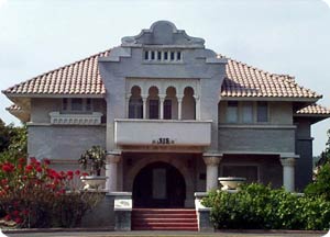
Theater Review. Cuckoos at The Maverick

Last Saturday the hubby and I dropped in on the Maverick Theater to see their production of “One Flew Over the Cuckoo’s Nest,” a theatrical adaptation of Ken Kesey’s novel.

Now I’m not much of a theater goer, I had never been to a local Fullerton production, and I have never written a critique of a stage production, so I apologize ahead of time, and you can take this review for what it’s worth.

The Maverick Theater is in the back of a  pretty unprepossessing industrial/warehouse building at 110 East Walnut Avenue, and you’ve got to give the Maverick folks a lot of credit – the single scene stage is about the size of my living room, and requires a deft choreography by the director and the cast. The venue lends itself to an extremely intimate relation between performers and the audience – the sort of proximity that lends itself to close study of the actors – for good or ill.

The story itself is the (pretty well known) dark comedy about the battle of wills between the conman Randall P. McMurphy, who has gotten himself committed to avoid a jail work detail, and the control freak-spinster-evil bitch-monster, Nurse Rached, who plays the nuts in the mental ward off each other for her own perverse satisfaction.

The leads are engaging actors; both Brennan Thomas as McMurphy and Julie Patzer as Nurse Rached were able to capture and hold audience attention, although Brennan’s choice of a Southern-sounding accent was a strange affectation in a story that takes place in the Pacific Northwest. I got the strong impression that a lot of Paul Newman in Cool Hand Luke had been injected into the performance, particularly in the scene in which McMurphy chastises his fellows for feeding off of him. Still, Thomas’ rollicking performance was satisfactorily charming and ribald.

The part of Chief Bromden, the Indian narrator in the Kesey book, was played by Enrique Munoz. It seemed like one of the toughest roles in the play, and Munoz essayed it with energy, but ultimately in what I thought was an overly hand-wringing and lachrymal manner that seems to miss something of the Native American character: the overtly disturbed and wounded-child of Bromden’s introspective monologues didn’t seem to translate well into the outward character’s relationship with McMurphy in the Second Act.

The performances of the supporting actors was uneven. David Chorley did a wonderful job portraying the shy and stuttering Billy Babbit; Scott Keister as Frank Scanlon, pulled off an uncanny rendition of Christopher Lloyd’s character “Taber” in the film version.  But some of the other parts were performed somewhat awkwardly or overly mannered. The ward attendants just didn’t seem to be able to get into the comic spirit of their parts while the sexually conflicted Dale Harding, as played by Stan Morrow, seemed too much like an over-the-top homosexual caricature.

Although it seemed a bit long, the productions was pretty entertaining and is worth seeing. I’m glad we went. The show runs through February 21.

The Questionable Promise of Technology

See? We told you it would work...

Using computers to arrange and sort data is useful for all sorts of things – especially when in comes to creating three dimensional imagery. Nobody can deny the impact of presenting scanned data for medical diagnostic purposes; or the use of scaled multi-disciplinary construction models that can simulate a 3D environment: very useful for ascertaining “clashes” between different trades as well as presenting the architect and client with views of his proposed effort.

But despite the technology drum beater’s boosterism (think laptops for kids, FSD style) there reaches a point in every computer application where the information is either too dense or voluminous to be assimilated or analyzed by those looking at it; or is just plain non-effective compared to traditional approaches; or worst, lends itself to misinterpretation or deliberate misrepresentation. This point of diminishing returns is reached quickest when the recipients of data just don’t know what to do with it. When that occurs they’re bound to do something bad with it.

Such may very well be the case with a City of Fullerton program that promises to create a three dimensional model of downtown Fullerton. We received an e-mail the other day from Al Zelinka, who works for the Planning Department. We point out that Mr. Zelinka is very careful to explain that the pilot program is being paid for by SCAG, not the City (where SCAG got the money is obviously not a point of interest for Mr. Zelinka, or, presumably, us).

First, we are inevitably forced to ask why. Who will benefit from the necessary resources plowed into such a program? It’s hard to answer.  And who will be able to use the information? We can envisage all sorts of staff (and consultant)  time going into creating maintaining and manipulating such data; and then the inevitable jargon and rhetoric tossed back to the public to foist staff driven projects onto the public. The Council: aha! See? The 3D model supports (fill in the name of the Redevelopment Agency’s favored project).

Perhaps the most important question is whether, once the model is done, it needs to be tended and updated by the City. If not, the effort going into seems to be something of a waste.

In any case the public are invited to a meeting on December 16th @ 6 PM in the Council Chambers to see the wonders of 3D modeling. No doubt all of our questions will be answered with sparkling clarity.

At the bottom of his e-mail Mr. Zelinka (AICP) includes a quotation that ought to give pause to even the biggest Planning Department cheerleader:

“Dedicated to Making a Difference.”

“Make no little plans. They have no magic to stir [women’s and] men’s blood….” – Daniel Burnham

Ay, ay, ay!

An Architectural Tale of Two JCs

Oops. “Community Colleges.” Oops. I mean “Colleges.”

It was the best of times, it was the worst of times…

while back we spent some time looking at the architectural monstrosities being foisted on students and bond underwriters (us) at Fullerton Junior College. We noted the crappy fake historical detailing, the blocky bulk of the overbearing McSpanish dinosaurs, and of course we regretted the intellectual confusion that equates fake old with real old and believes building crappy architecture enhances historical buildings.

Here’s a reminder of what we were talking about.

We were right. They did put a cupola on it.

Ye gods! A series of out-of-scale, fake-arched, hollow-walled, Styrofoam-corniced, bulk-squatting godzillas dumped across the campus.

We also lamented the fact that in lower-middlebrow land nobody seemed capable of conceiving the deployment of inventive and engaging contemporary architecture.

In response to a follow up post this fall, a Friend forwarded images of some recent buildings that have gone up at Santa Monica (Junior) College. We share them below.

Theater Arts Building
The Broad Theater
The Broad Theater
Science Building
Science Building
Science Building
Science Building
Illustration of Student Services Building

Hmm. Food for thought. Okay, the west side of LA, SM, and Culver City are chock-full of talented architects and designers of the SCI-Arc variety, and north Orange County is chock full of…well, let’s let that one go for now.

What’s baffling is that there doesn’t seem to be anybody on the NOCCCD staff or board with a clue. Instead of doing new buildings that actually stimulate aesthetic interest, they prefer to cough up the dreary, banal, and embarrassing visual tripe of McSpanish. And then threy dredge up support for their travesties from equally clueless citizenry.

Time for a change?

Some History Behind Architectural Veneers

We’ve made a pretty big deal on this blog about the use of brick veneer, specifically, the way our Redevelopment Agency has always insisted on slathering it on to stuff to try to give the false appearance of historic structure, or under the guise of matching what is supposed to be the building material par excellence of downtown Fullerton: red brick.

We thought it was about time to get an historical perspective on the uses of architectural veneer – particularly masonry veneer, and so we have once again called upon the good offices of Dr. Ralph E. Haldemann, Professor or Art History (Emeritus) at Otterbein College, and our adjunct Arts and Architecture Editor. Doc?

haldemann-500x332
When you want to find out, go to the best...

The question of the role of veneers in architectural history is really quite fascinating, but requires an amount (admittedly minimal) of erudition. I will try to sum up some thoughts on the subject. 

In pre-modern times the nature of building materials basically necessitated that structural materials were de facto finished materials as well – although historical exceptions are not uncommon: we know of course, that the Romans during the Imperial Era were fond of using stone veneers on brick buildings to dress them up. Such uses of marble veneer were often used in the Western Mediterranean basin countries in Romanesque and Italian/Venetian Gothic buildings.

The use of plaster cement or lime-based coatings on brick, especially non-fired brick, has an ancient lineage that reaches forward into the adobe buildings of California’s own Mission period; however neither this application nor the modern use of lath and plaster on studs can be considered a veneer. 

Medieval Europe, particularly in the  non-deforested climes of the north, saw a rise in timber construction in which the structural members were exposed and the interstitial areas filled with plastered wattling. Again, such fill even though non-structural, cannot rightly be called a veneer.

With the advent of structural iron and steel, fill materials in modern commercial architecture remained brick (for practical and fireproofing reasons). However, terra cotta facings with ceramic finishes attached to the underlying structure became the norm from the 1890s through the 1920s; the wide adoption of moderne styles in the 20s and 30s often replaced highly detailed terra cotta with simpler and smoother concrete and even ceramic tile finishes. These uses generally applied a finished masonry surface over an unfinished substrate of common brick. These are veneers.

It was really in American domestic architecture that brick veneers (almost exclusively brick) captured the imagination of a growing bourgeois sensibility. After the industrial age had ushered in standardized lumber, machine made nails and mass produced balloon-frame wood houses, a longing for the perceived hominess and historicity of brick set in. This was aided by several cultural American Colonial Revivals, particularly in the early 20th Century that coincided nicely with eras of vast suburban expansion. It was all mostly a real eastate come-on.

The use of phony brick surfaces continued unabated in the little cracker box houses of the ’50s and persists happily to this very day, particularly in subdivisions where an emotional attachment to American historical antecedents is being peddled.

The use of fake brick fronts in commercial areas followed the same suburban trajectory as the use of the material in domiciles. It too persits today, particularly where city fathers and chambers of commerce wish to deal out a conjured up historical image for their otherwise unremarkable and humble burgs.

Modern architectural theory held that this sort of use of non-structural masonry veneer is fundamentally non-truthful, meretricious and basically a middlebrow (or lower) affectation. And so it is!  And yet the Robert Venturi school of Post-Modernists embraced such use for its exuberance, color and tactile properties, as well as potential (often ironical) historical connotations. However it must be said that when the historical connotation is wrong, or the deployment is meant to be deceptive or even slavish, a real aestheic problem exists; and can, if left uncontrolled, lead to real civic embarrassment.

Ralph E. Haldemann, Ph.D.

God-awful “Fox Village” Gets Even Worse!

http://www.youtube.com/watch?v=tUWTXt0TRkQ

Remember those horror movies when the outraged villagers grabbed their pitchforks to have at the monster? What the “Fox Village” monster could use are a few more angry villagers.

At the City Council “workshop” on Tuesday the new plans for the existing city-created empty space behind the Fox Theater were rolled out. And while the reception by the public wasn’t pretty it wasn’t enough to kill off the monster, either.

What was rolled out were several elevations that raised the curtain on a hideously confused jumble of themes and materials that were supposed to be modernish, but that had that certain flavor of architectural renderings done by crazy people.

Egad. What a freaking mess...

A hodgepodge of shapes and veneers with no apparent cohesion and not a whiff of aesthetic originality. Stone veneer on the first floor obligatory.

Oy Vey!
Oy Vey!

Have Fox Villagers gone insane? What a mish mash!

Say what?
Say what?

Why are they still trying to move McDonald’s? Didn’t the Council put that idea to rest? And yet here it is again! Can anyone say “insubordination”? Guess not – in Fullerton! And look a parking lot on the corner. Just what downtown needs – another permanent hole in the building fabric of downtown Fullerton.

Send in the clowns...

Ah, the inevitable “pedestrian paseo.” Just lookit all the happy, bedazzled consumers. And that fountain! Precious. Makes you want to make a wish and toss three coins in.

Folks if you aren’t ready to go grab your pitchforks by now, we suggest that we stick a fork in you –  because we think you’re done.

New Parking Structure Approved. More Brick Veneer in Our Future

On Tuesday our City Council took up the matter of the proposed parking structure on Santa Fe. Since we first reported on this issue City Staff has maintained its ludicrous attachment to the brick veneer panels, and its equally ludicrous position that fake brick somehow satisfies some sort of CEQA requirement – even though WE HAVE COMPLETELY DEMOLISHED THE MYTH OF BRICK AND REALITY OF BRICK VENEER IN DOWNTOWN FULLERTON.

Such a lame approach insults not only our aesthetic sensibilities, but it also turns the whole environmental review process into a pantomime that just provides staff cover for what it really wants: fake brick.

pk with brickCONSIDER THIS: THE MONEY SAVED BY ELIMINATING THE USELESS BRICK COULD GO TO ESTABLISHING SOLAR PANELS ON THE BUILDING AND ENHANCING ITS SUSTAINABILITY QUOTIENT.

pk with no brick


Happy 50th Anniversary Sunny Hills H.S.!

DSC00016
More Exaggerated Modern!

POST UPDATE:

A Taste of Sunny Hills

Our 50th Anniversary Celebration will officially begin with “A Taste of Sunny Hills: A Taste of Talent, Food and Reunions”, on Saturday, September 26, 2009 from 4:00 p.m. until 8:00 p.m.

Bring your family and join us on the Sunny Hills campus for:

– “Tastes” from local restaurants include: Beach Pit BBQ, Chomp, Cafe Hidalgo, Slidebar, Heroes, Phan 55, Koba Grill, Hashigo Sushi, El Matador Cantina, Top Class Pizza, Twin Dragon Chinese Food, Rutabegorz, EHF Fundraising, Lascari’s, and Cajun Swamp!

– A special “KidZone” sponsored by the agriculture department with carnival games and a petting zoo. Jamba Juice will be available in the “KidZone” along with kettle corn and a “candy store.”

– “Reunion Row,” a special place to reconnect with classmates from years past and relive high school memories.

– Live entertainment venues featuring music, comedy and dance from incredible Sunny Hills student and alumni entertainers.

– 50th birthday cake will be served with coffee provided by Starbucks.

Admission for the event is free.

I have received several emails from Friends inquiring about examples of sustainable design in Fullerton.  Sunny Hills High School is a great example of sustainable design.

DSC00009
An umbrageous architecture...
DSC00006
Windows and walkways are shaded...

Concrete structure, steel framed windows both on the north and south sides of all the classroom buildings were built to last; a great cantilevered roof design  provides ample shade while still allows natural light and ventilation to pass through thus not needing HVAC all the time.

DSC00028

The roofs have the perfect pitch and design to accept solar panels for future conversion. When I found out that SHHS opened 50 years ago today, it confirmed the theory that good design will assure that buildings will last for as long as the materials they were built out of will let them.

The new school just around the corner is just 5 years old, and is already starting to fall apart – but more about that in a separate post. DSC00004
Open air food court
Open air food court

Oh No, Brick Veneer Again!

ParStruck

UPDATE: THE CITY COUNCIL IS SCHEDULED TO TAKE UP THE MATTER OF THE PARKING STRUCTURE AND ITS DESIGN AT TODAY’S MEETING. SINCE WE REPORTED ON THIS ISSUE CITY STAFF HAS REFUSED TO CHANGE ITS LUDICROUS POSTION THAT THE FAKE BRICK SOMEHOW SATISFIES SOME SORT OF CEQA REQUIREMENT – EVEN THOUGH WE HAVE COMPLETELY DEMOLISHED THE MYTH OF BRICK AND REALITY OF BRICK VENEER IN DOWNTOWN FULLERTON.

SUCH A LAME APPROACH INSULTS NOT ONLY OUR AESTHETIC SENSIBILITIES, BUT IT ALSO TURNS THE WHOLE ENVIRONMENTAL REVIEW PROCESS INTO A CHARADE THAT JUST SECURES FOR STAFF WHAT THEY WANT: BRICK VENEER.

 CONSIDER THIS: THE MONEY SAVED BY ELIMINATING THE USELESS BRICK COULD GO TO ESTABLISHING SOLAR PANELS ON THE BUILDING AND ENHANCING ITS SUSTAINABILITY QUOTIENT.

They just can’t seem to help themselves. Not long ago the City held a “stake holder” gathering that was supposed to display three alternative plans for the proposed new parking structure on Santa Fe Avenue.  No sooner had the meeting begun than it became apparent it was going to be one of those typical  “here’s what we’re doing so sit down and shut up” meetings.

The image above shows what the City wants the building to look like. The architectural elements look okay except for the hideous brick veneer – that tomato soup colored stuff you see on the building. Brick veneer. The lazy Redevelopment bureaucrat’s material of choice. We recently wrote about it in a pithy post here.

Why would anybody put a brick veneer on a concrete parking structure? Who would put lipstick on a pig? Brick panels spanning impossibly long spaces look simply idiotic – even to the layman who could sense intuitively that brick has little tensile strength; but unfortunately this type of masquerade is par for Fullerton’s aesthetic course – displaying once again the curious parochialism of Fullerton’s taste makers.

But brick veneer is not only stupid architecturally, but is a big waste of money, to boot. And it contradicts the General Plan Advisory Committee’s adopted “sustainability” policy in the General Plan Update, since it serves no function and will have to be replaced when it falls off.

Fortunately it’s not too late to make the right choice here. But we’re not holding our breath.

Downtown Fullerton: The Brick Myth, The Reality of Brick Veneer, and The Legacy of Schlock

We published a couple of posts a few days ago on the new parking structure planned on Santa Fe Avenue, and how it is proposed to be faced with brick veneer here and here .

You may remember that I got to thinking about why the city staff would tell the RDRC that the $40,000,000 parking structure must have brick veneer; and that I asked one of the RDRC Board members that very same question, and the answer I got was that staff told the Committee that the City has to use brick veneer because it was a “State” requirement to meet the CEQA guidelines. (I also noted that the use of fake brick is in complete contrast to the sustainable design the General Plan Advisory Committee has spend the last 3 years discussing and recommending to the City Council).

CEQA? Yes CEQA he said, because there’s a provision in the CEQA guidelines that requires mitigation of any visual impacts. In other words, since the new parking structure was being built with structural concrete, and the surrounding downtown has many brick-looking buildings, using the brick veneer would cause no visual impact on the environment. I say “brick-looking” because so many of the buildings in downtown Fullerton are faced with fake brick veneers, facades that are not historic, and some of which, in fact, were stuck-on older buildings during the course of Redevelopment in the last 30 years. And many of these were subsidized by the taxpayers of Fullerton.

How do I know this? I did a building facade survey of downtown from the RR tracks to Chapman and from Malden to Pomona. I documented the principal “building skin” of each structure. The results didn’t surprise me, but they may surprise you; they should shock the Redevelopment and Planning Department “experts” who not only have been tolerating, but actually promoting this material over the years – seemingly in an effort to keep downtown “historical” looking. Boy, did they get it wrong.

Here are the results of the survey:

24 Brick veneer

2 Flagstone veneer

9 Real brick & clay block

3 Glazed & fluted brick

24 stucco & plaster

20 Concrete, concrete block & terra cotta

And here is a useful overhead image with the various exterior materials colored in on each of the building’s footprint. Notice how few real brick buildings there are; and of these only a couple are red brick – the crap of choice among Fullerton’s bureaucratic tastemakers. The buildings with substantial brick venerers are pink.

Downtown Fullerton

Using CEQA to bolster the poor design choices of the past is pretty bad. Let’s hope this post will help end the travesty of bad and cheap looking architecture based on erroneous assumptions, and that California’s environmental laws will never be used again by city staff to foist this garbage on us.

The RDRC and Jay Eastman Take A Curtain Call

DSC00132

Don’t say we didn’t warn you. Because we did. In previous posts  here and here, we tracked the progress (if you really want to use that word) of the strip center at Euclid and Rosecrans. Well, the scaffolding has come down and what’s revealed ain’t purty.

Our theme here was wasted space and building materials and of course, The City’s dubious commitment to the idea of sustainability. And our purpose was not to dwell upon the poor aesthetic choices made by the owner of this center. Instead we chose to focus on the City’s role in this aesthetic disaster. For some reason the Development Services Department (they serve developers) decided that this non-subsidized, private remodel needed to go to the hapless Redevelopment Design Review Committee – even though it is miles from a Redevelopment area.

Planner Jay Eastman made it clear that the RDRC intended to impress its preferences unto this site – no doubt assisted by Mr. Eastman himself. Let’s let Barbara Giasone help us with our narrative from a May1, 2008 story:

“The proposed remodel was reviewed by the Redevelopment Design Review Committee last week, but the panel felt the design was commonplace and didn’t reflect the character of the neighborhood, Acting Chief Planner Jay Eastman said. The architect was asked to look at the surrounding neighborhood with terms like “country,” “rural” and “equestrian,” Eastman added.”

Country. Rural. Equestrian. Got it?

The ensuing visual train wreck of disjointed parts, shed and gable roofs, the weird confusion of masonry veneer and stucco, and all the wasted attic space with its dinky windows provide a suitable denouement, fifteen months later,  for this cautionary tale. If the property owner had been left to his own devices it is hard to conceive anything worse being done – and it could have been done a lot less expensively.

We wonder just what sort of idiots our staff and their RDRC think inhabit rural equestrian areas.

DSC00135

DSC00129DSC00144

DSC00130DSC00141