I received this post from a Friend who wishes to remain anonymous for reasons that you may understand after you read this post.
Think historic neighborhoods. Immediately, one’s mind goes to such places such as Bungalow Heaven in Pasadena, Harper’s Ferry, West Virginia and others where houses, landscape, and layout reflect a distinct architectural coherence.
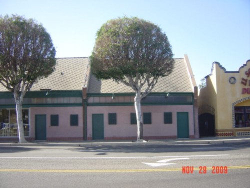
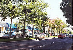
What we don’t think of is the hodgepodge of homes built over a span of more than fifty years within the boundaries of Skyline, Frances, Luanne, Canon and Lemon here in Fullerton. True, the neighborhood has a sort of charm. But this four block area (oddly denuded of trees) doesn’t fit the definition as historic.
Yet, for over twenty years, this neighborhood has been besieged by a small but persistent group to designate itself as such. The original movement came about when a neighbor (who has since moved away) decided the mix of 60’s ranch homes, 30’s Spanish Mediterranean and 80’s boxes needed to be protected.
Why? Because the empty lot behind her house, which she had enjoyed as her own personal open space, was going to have a house built upon it. This led to a movement asking for historical designation, with one very vociferous neighbor putting out a letter decrying such crimes as pink flamingos in yards. It ended when a flock of roving pink flamingos went from yard to yard, to rebuke this snobbishness. It was clear then, as it is now, that the historic designation is more to control everything from the color of homes, the installation of skylights, solar panels, to pink flamingos in yards.
In more recent years, the issue was raised again when a member of the Fullerton Heritage group moved into the neighborhood. This woman could often be seen taking photographs of her neighbor’s homes. She personally crossed the boundaries of neighborliness by posting a photo of one on their website as an example of “muddled and conflicted” architecture. Battle axes were raised when during a neighborhood meeting, an argument ensued. This busybody sat in the back, mute –rendering herself all but invisible. At no point did she offer any explanation why this issue meant so much to her that she was willing to pit neighbor against neighbor.
The reasons for not wanting this ridiculous designation are simple.
1. There’s no consistent architectural coherence in the boundaries of Lemon, Skyline, Frances, Luanne and Canon. While there are individual examples of historically significant architectural styles, as a neighborhood – it lacks consistency and coherence.
2. It would give Fullerton Heritage – and the City Planning Department far too much power over our neighborhood. Note, they already have ultimate veto power over designs submitted to the city for everything from new development to remodeling in other neighborhoods designated as a historical zone. In one neighborhood, they vetoed the homeowner’s request to install a skylight. Such oversight is petty, and subject to the changing whims of the board.
3. This will lead to more “fake old” McSpanish architecture. Another uninformed member of the Fullerton Heritage group noted at a meeting at Hillcrest Park that she thought the predominant style in the neighborhood should be “Spanish Mediterranean,” whatever that means.
4. The $1000 fee for the designation doesn’t even begin to cover the costs of actual staff time. In addition, this doesn’t cover the costs of ordered revisions by the owner’s architects or engineers. Fees like this are never gotten rid of, rather, the fee could be raised and the neighborhood would have no control over the amount they have to pay.
5. The city of Fullerton has a permit process already in place. This is an added layer of bureaucracy with not only more additional staff time needed, but oversight from an outside organization (Fullerton Heritage).
6. A small cadre of neighbors has already been vociferous to the point of rudeness about things they don’t like: the color of a neighbor’s home, plantings, flamingos, and more. Worse, their gossip has hit people in ways that have become personal. While we realize they are voicing their opinion, we’d hate to give them permission to authorize or disapprove on any official level.
At some point one must work with and trust the neighbors. Most of the neighbors who support this notion have lived in the area for 40 years without the intervention of the city. Why they think they should leave future generations with a law to be enforced long after they have enjoyed their own latitude –is for reasons of ego. While the notion of a historic neighborhood seems appealing, in reality it is cumbersome, vague and will leave future homeowner’s with no choice but to deal with more government and bureaucracy. It was clear twenty years ago as it is now: these people need to get a life.
All we can do is work with one another, and be neighborly but not meddlesome.
